


 25 Apr 2025
Tags: New branding, Visit Park City, Park City Utah, Sustainable Travel, Sustainable Tourism
Not long ago, a pinecone was used to represent the image of Park City, contrasting the mountain town’s alpine atmosphere with the red rock desert landscapes that dominate Utah’s image and national park attractions.
Today, it isn’t enough to just be ‘alpine’ in nature. Park City has a complex set of values and priorities, and the pinecone (known as ‘Piney’) wasn’t multidimensional enough to communicate everything the town wanted to say about its future. Key stakeholders gathered to rethink the image that best represents the people who live, work, and play in this area.
Enter Mountainkind—a term that is a testament to our efforts to combine our love of our alpine environment (Mountain) and a shared passion to protect and preserve (Kind) this place for the next generation. Mountainkind, paired with our new P-form icon and a color palette reflective of our year-round offerings, the new brand is primed for iteration as we evolve and open our arms to those who share our values.
We are honored to share that Mountainkind received 1st place honors in the Business and Marketing category at the global Green Destinations Top 100 Story Awards 2025, and we are humbled to have achieved a Mountain IDEAL certification, one of only four cities in the U.S. to have qualified. This recognition solidifies Park City as a community dedicated to addressing challenges such as housing, environmental issues, and preserving its cultural and social heritage.
One year on, we are thankful to the community of Park City, our partners, and visitors for investing in Mountainkind with us, paving the way for community engagement and facilitating responsible tourism and growth.
--------------------------------------------------------------------------------------------------------------------------------------------------------------------
More details about the development of the brand:
Park City has an animated past and ambitious future, and its story—of diverse residents and decades of challenge—deserves to be told. With the announcement of the 2034 Olympic Games returning to Utah, robust environmental initiatives, and growth on the horizon, Park City’s meaning of place and impact on people’s lives has changed.
The Park City Chamber of Commerce and Visitor’s Bureau, which manages Visit Park City, plays a critical role in defining our town for visitors and locals alike.
In 2024, the Chamber & Visitors Bureau launched a new brand for Park City. The goal was to define Park City as a place where respect and stewardship are at the forefront of the town and its image. If you remember Park City's past ads and website, you may recall “Piney,” the graphic pinecone icon used for over two decades! But Piney was indicative of a different era and Park City needed a new look and feel to showcase this place where people live, play, and work in a positive and forward-thinking way.
Every good brand needs a platform—Park City's is Mountainkind. This is a dynamic word that plays three roles: adjective, noun, and verb. Mountainkind is to take meaningful community action, promote stewardship, and be mindful of others and wildlife. Mountainkind combines Park City's stewardship goals and initiatives into one effective term, allowing for easier connection, communication, and showcasing the community's culture and approach to living in the mountains.
The new emblem is a graphic icon featuring six P-style forms arranged in a circular pattern. If you see a snowflake or a flower, you’ve got the idea. But look closer, designed with intersecting symmetrical lines, additional shapes highlight different elements of Park City: ski runs, a map of town, the spokes of a bike wheel, and even the shape of a ski boot. Like Mountainkind, the emblem is dynamic with different levels of meaning that can be used to showcase Park City as the year-round destination that it truly is.
We live, work, and play in a vibrant place! From striking fall hues of red, yellow, and orange, pristine white in the winter, and the lush greens of our abundant summer foliage—our new palette reflects the organic color range you see in Park City year-round.
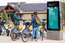
The new color palette is combined with the emblem and Mountainkind verbiage to create badges and word marks that you’ll see around town, on Visitparkcity.com and guest guides, the Summit Bike Share, Park City's free transit system, and other places highlighting helpful, meaningful information. When you see these, you’ll know you’re part of the Mountainkind.
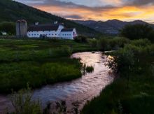
Intentional ChangeCreating a sense of place is a fundamentally human thing. The way we decorate our homes, whom we spend our time with, and how we engage our communities are all ways that define our sense of place and values. Park City is a canvas, with people painting this place in new ways since before town was even incorporated in 1884. Before Park City was a silver town, it was a place of Ute, Shoshone, and other indigenous tribes. And now—not just a ski town but a year-round alpine destination wrapped in diverse arts and culture, recreation, and incredible people working to protect its past and evolving future.
Change is inevitable and should be embraced with intent. With Mountainkind, Park City is steering its own future and encourages visitors and locals alike to treat this incredibly special place and each other with respect and stewardship!
